Corineus Global
Discreet Security Advisory
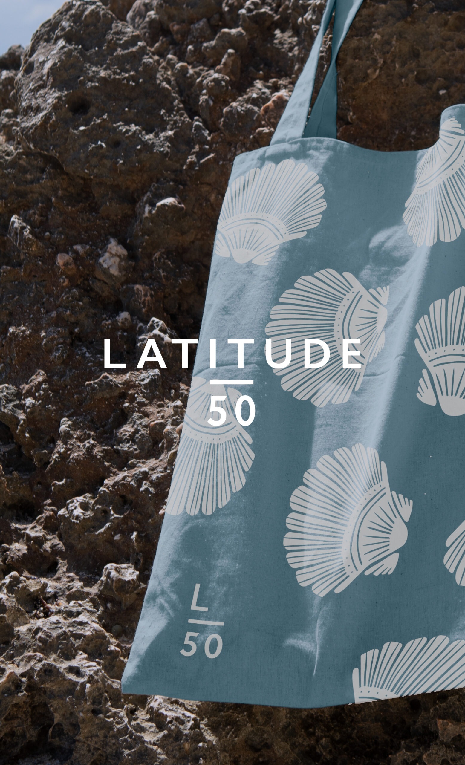
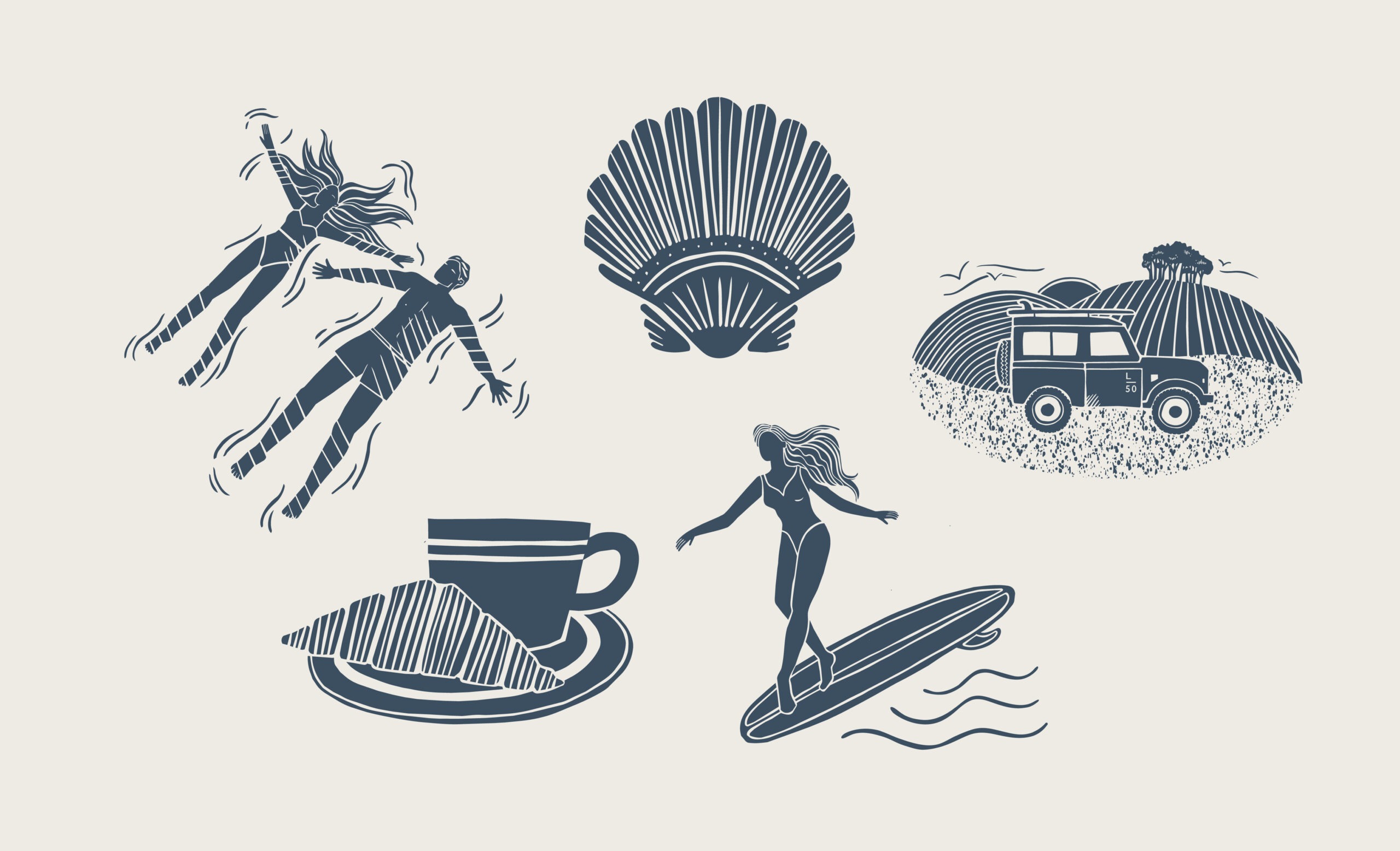
Latitude50 approached us to create a series of illustrations that would refresh their visual identity while staying true to their existing brand. Starting with hand-drawn sketches, we developed a style that balanced character and refinement, keeping the natural imperfections that give each piece a human touch. Inspired by their previous lino print approach, we evolved the look into something cleaner and more contemporary, drawing from modern coastal illustration while retaining key visual cues. The result is a flexible, cohesive illustration style that brings warmth, personality and a more current feel across both print and digital touchpoints.
Brand Identity Design
Hospitality & Tourism
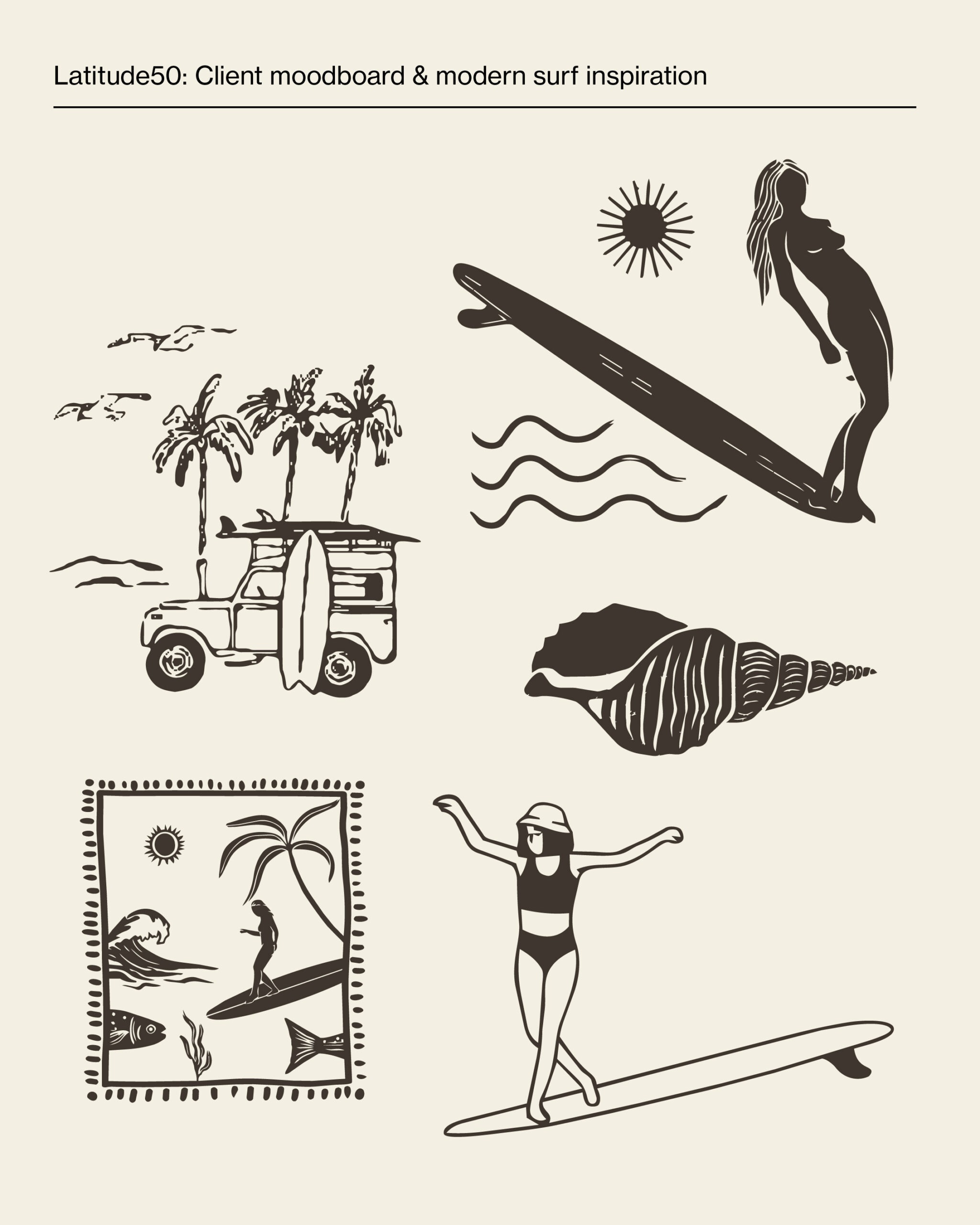
Latitude50 came to us looking for a series of five illustrations, that would sit alongside their existing assets while bringing a fresher, more elegant feel in line with current trends and aesthetics.
Known for their handpicked holiday properties tucked along the north coast of Cornwall, Latitude50 crafts the kind of holidays you’ll remember long after you leave. We wanted that same thoughtfulness to come through in the illustrations. Starting by hand sketching each design, working through the composition until it felt right, before being scanned and finished digitally. The raw, slightly wobbly lines were kept very much intentionally, a nod to the artist’s hand that gives each piece its character.
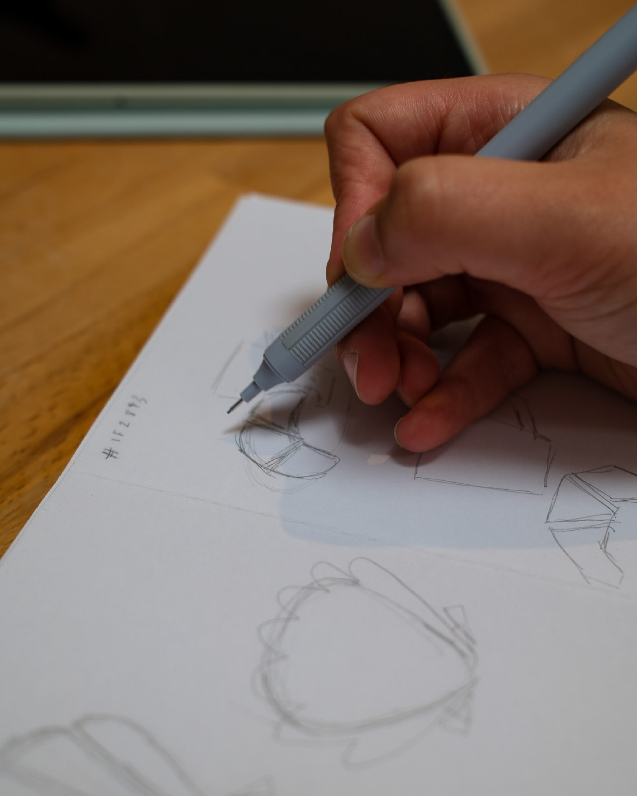
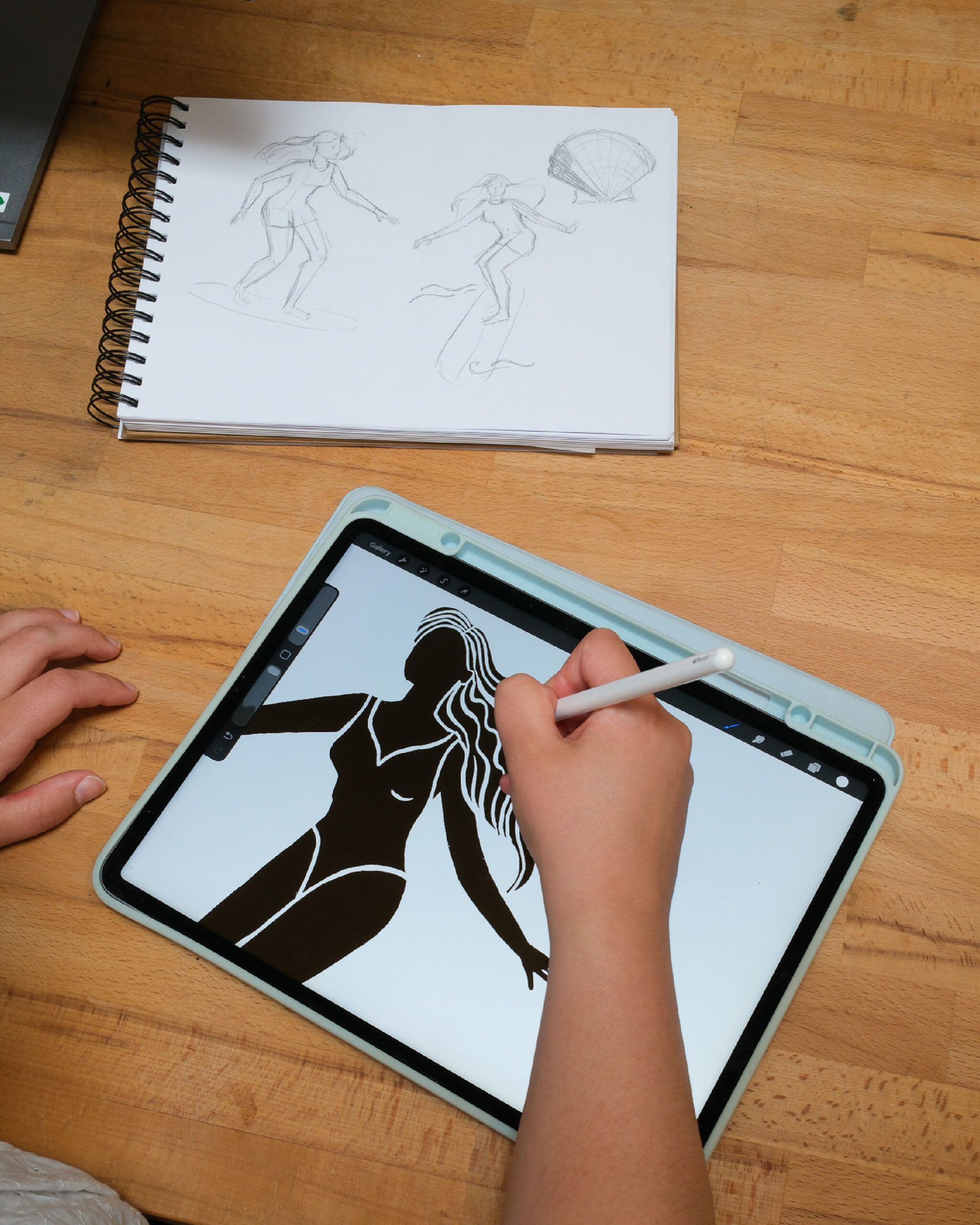
Keeping things consistent with their existing work, was just as important as anything new that we were adding. Latitude50 wanted to move on from the lino print style they’d used before, and while it had felt at home with the brand’s “hand picked” identity, it had started to feel slightly dated and bulky at times. Rather than abandoning the lino style entirely, we embraced its most distinctive quality, the inverted line that comes from the nature of the printing process. A browse through modern surf and coastal illustration did the rest, helping us land on a style that feels current without losing the connection with the rest of the original illustrations.
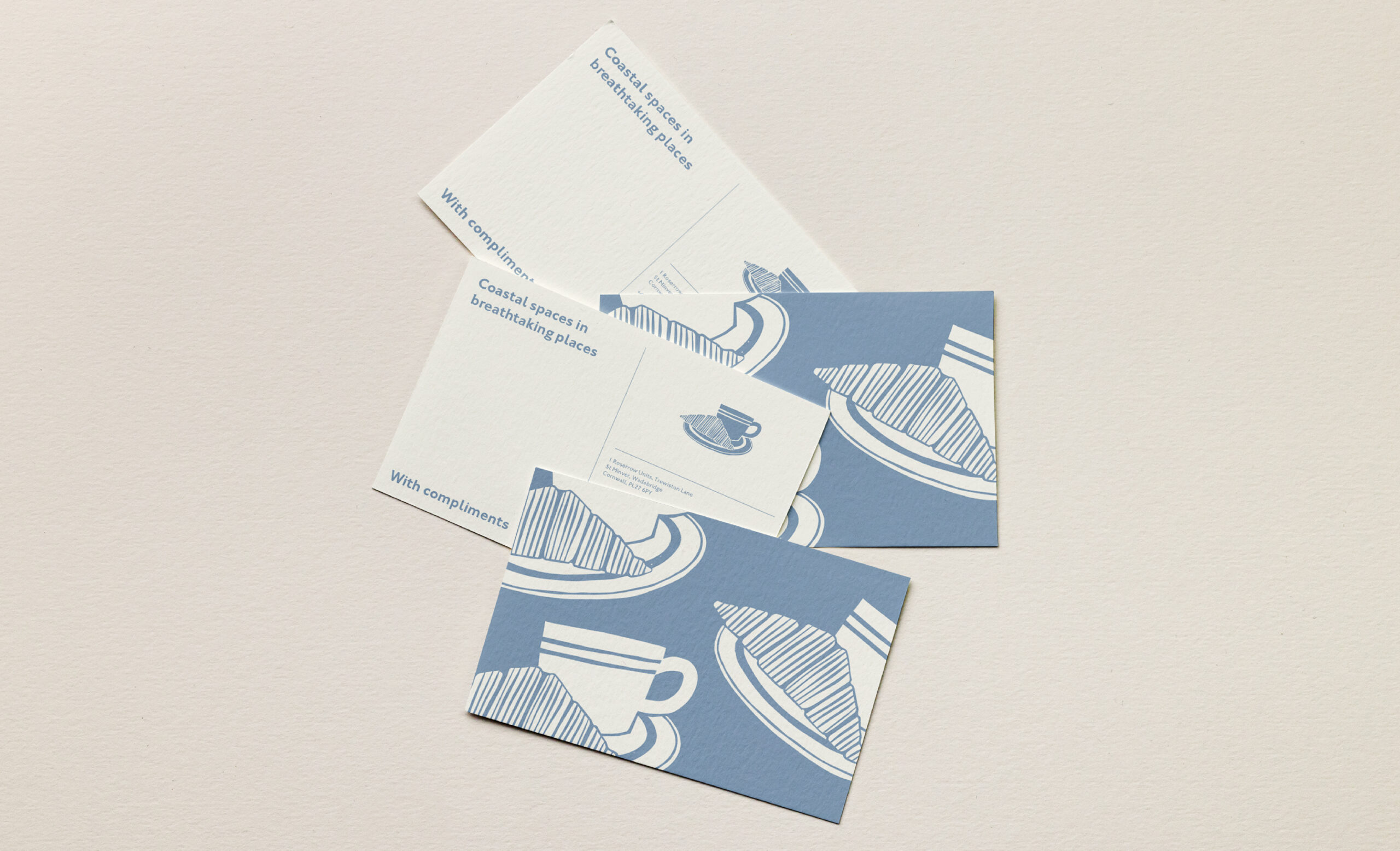
Stepping away from the texture of the printing process also helped push things in a cleaner, more modern direction. It did mean rethinking how we handled line quality throughout, particularly in trickier areas like the swimming couple, where the lines needed to work a little harder to tell the story clearly.
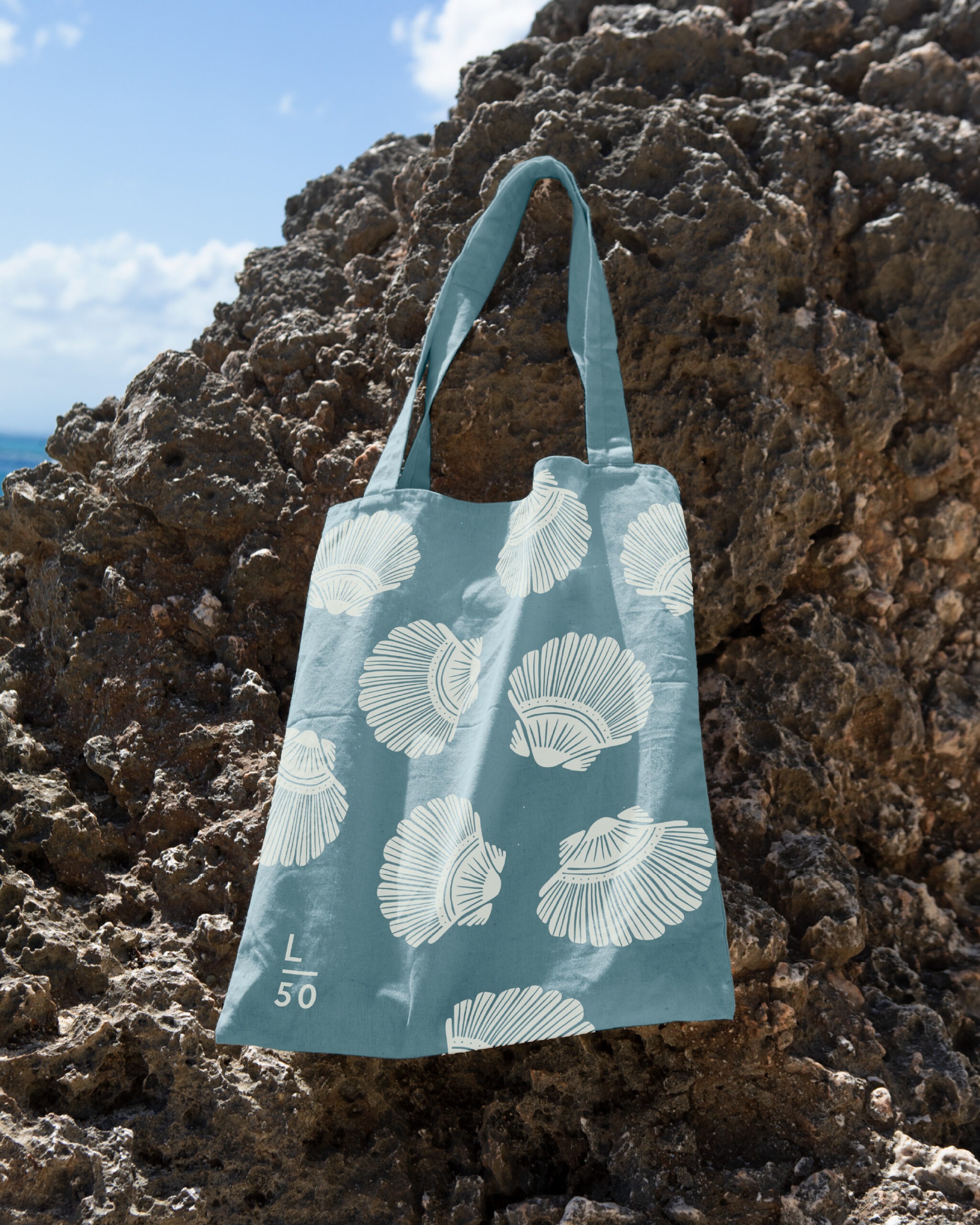

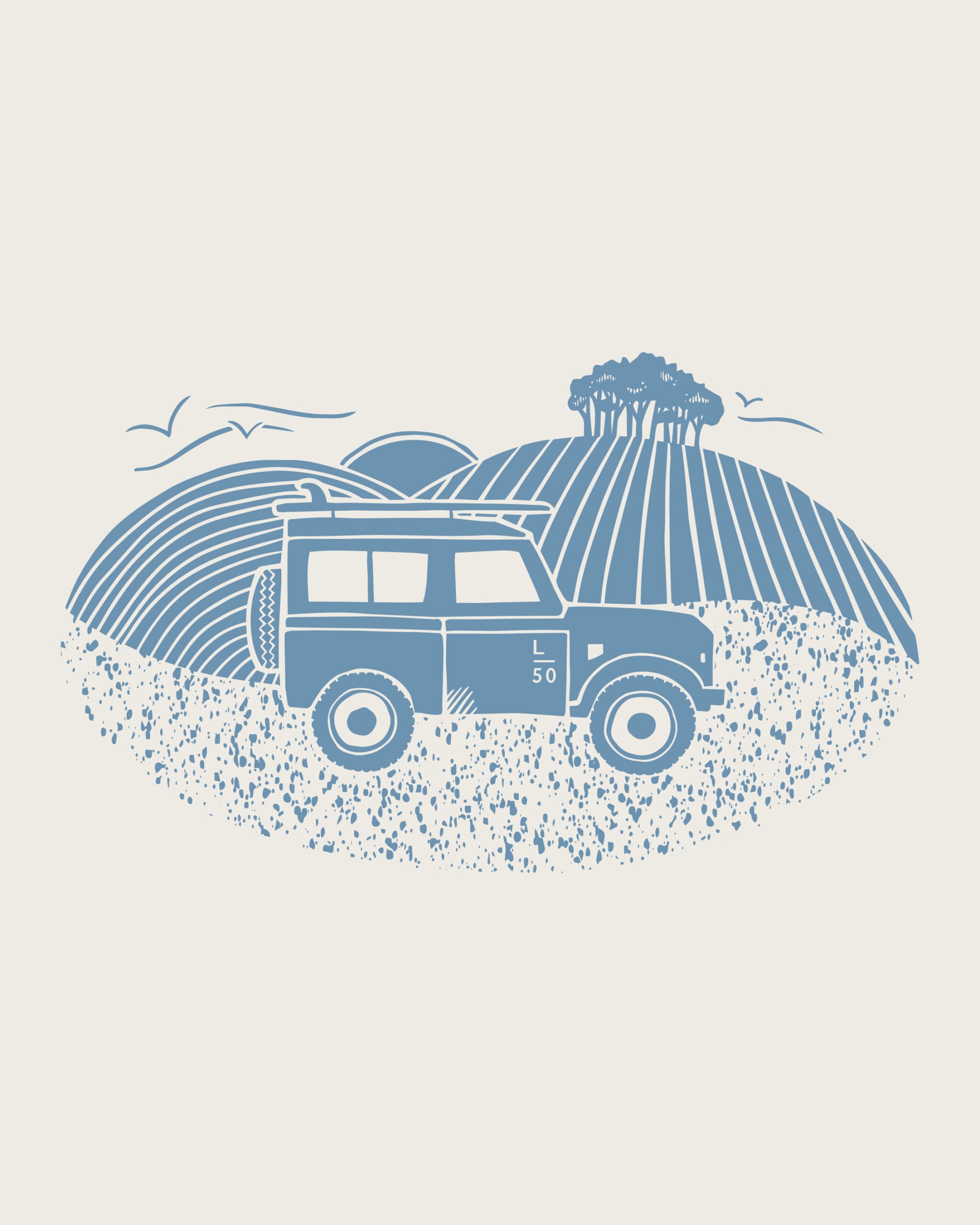
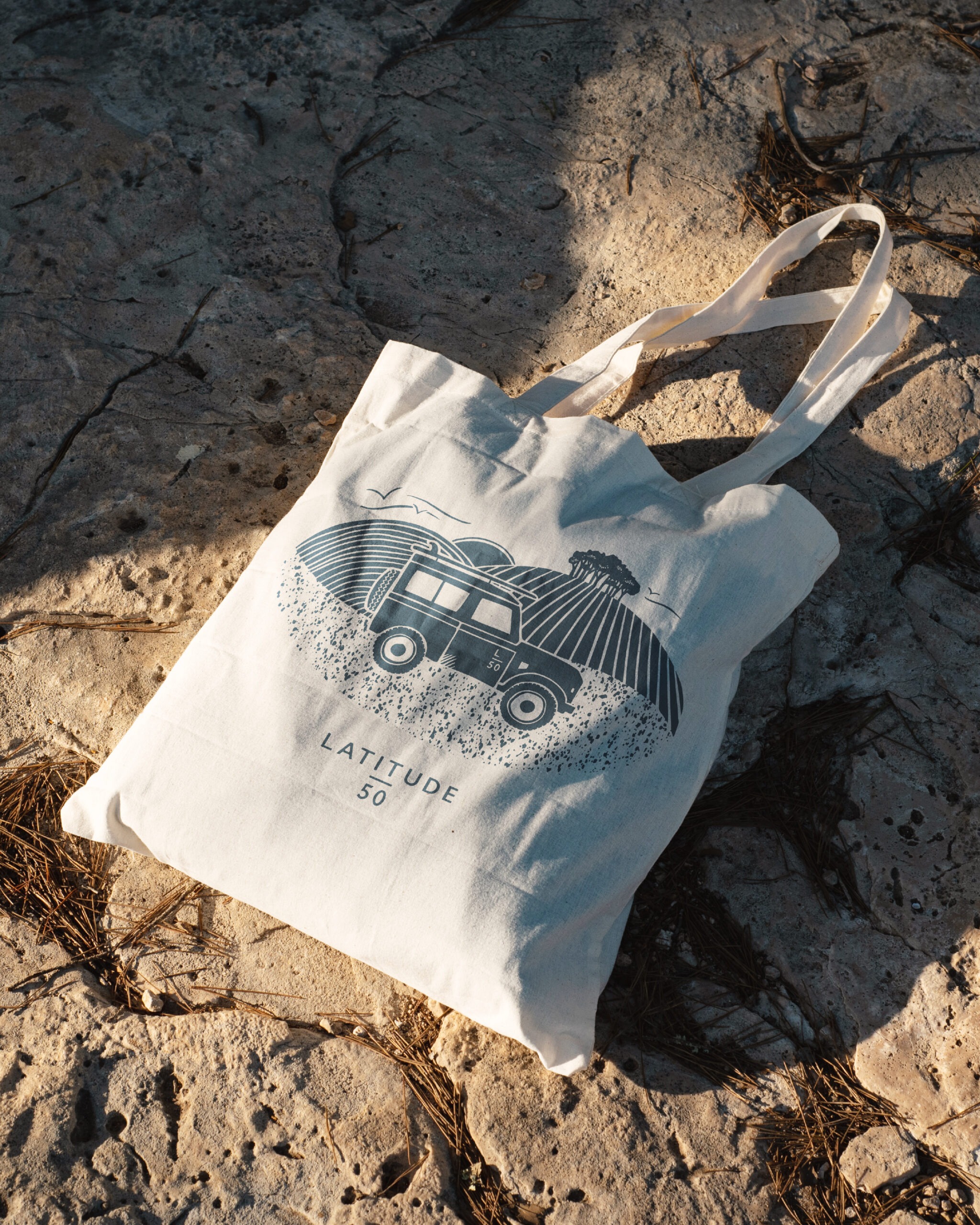
These illustrations will roll out across the Latitude50 brand in all sorts of ways, from physical bits and pieces like tote bags, postcards and business cards, to digital touchpoints like social media and email newsletters. It’s a good reminder of what illustration can do: highlight a brands personality, make it more memorable, and give the storytelling a more human, personal feel. If you’re thinking about refreshing your brand’s illustrations, or just want to explore something new, we’d love to hear from you.
Pippa, Marketing Executive