Fri 26 Jun 2026
Behind the Screens: Latitude50
There’s something satisfying about knowing when not to start from scratch.
Latitude50 came to us looking for a new series of illustrations. The brief wasn’t to reinvent the brand, but to evolve it. To create something that felt fresher and more contemporary, while sitting comfortably alongside the illustrations people already recognised.
It’s often the trickier route.
The original artwork had a warmth to it that felt completely at home with the brand’s handpicked approach to holiday letting. But like many visual styles, it had started to feel a little heavy over time. The challenge wasn’t replacing that personality, it was finding a way to carry it forward.
We started where we always do: looking.
The existing illustrations. The client’s mood boards. Contemporary surf graphics. Coastal publishing. Artists whose work felt effortlessly simple. Slowly, a common thread began to emerge.
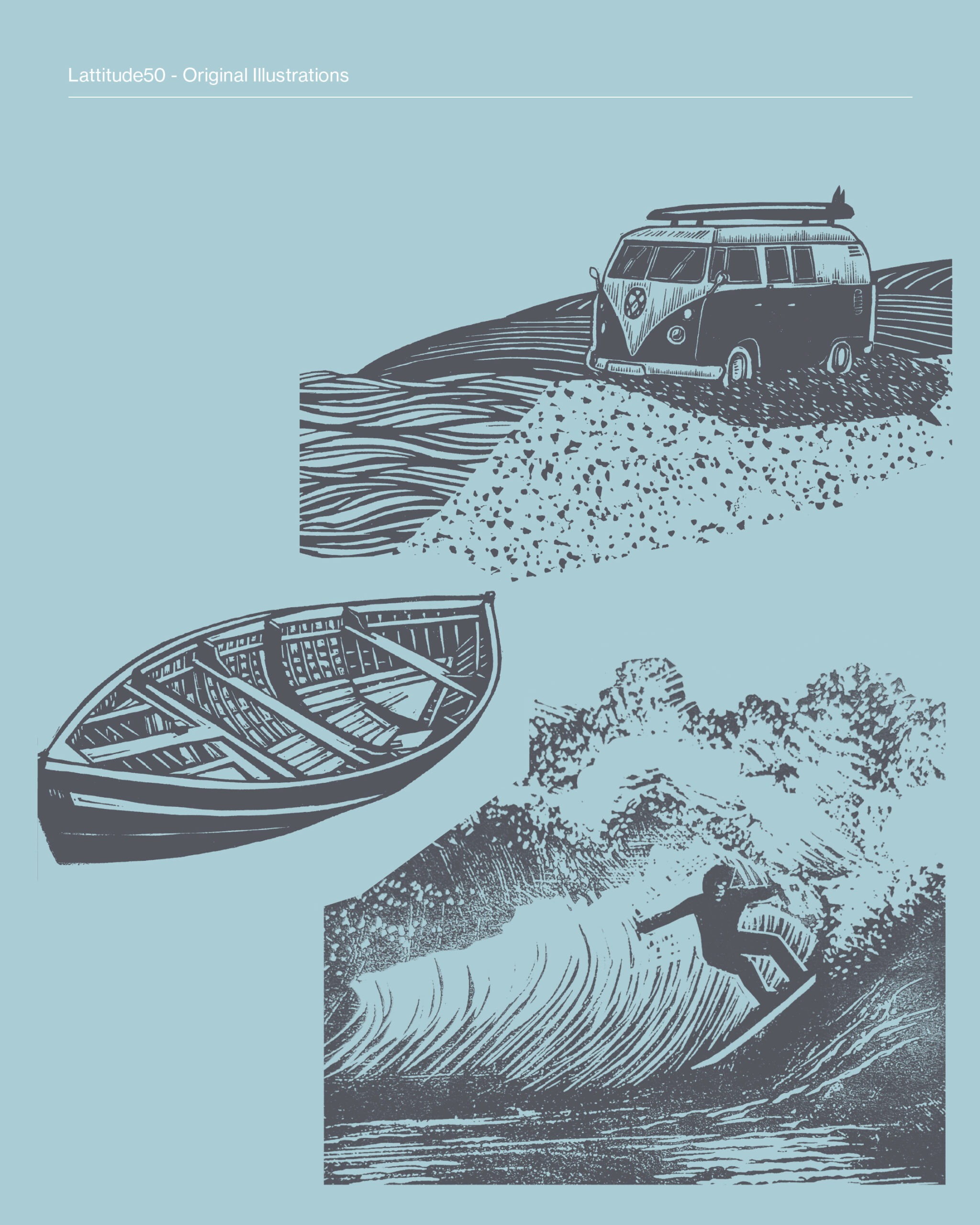
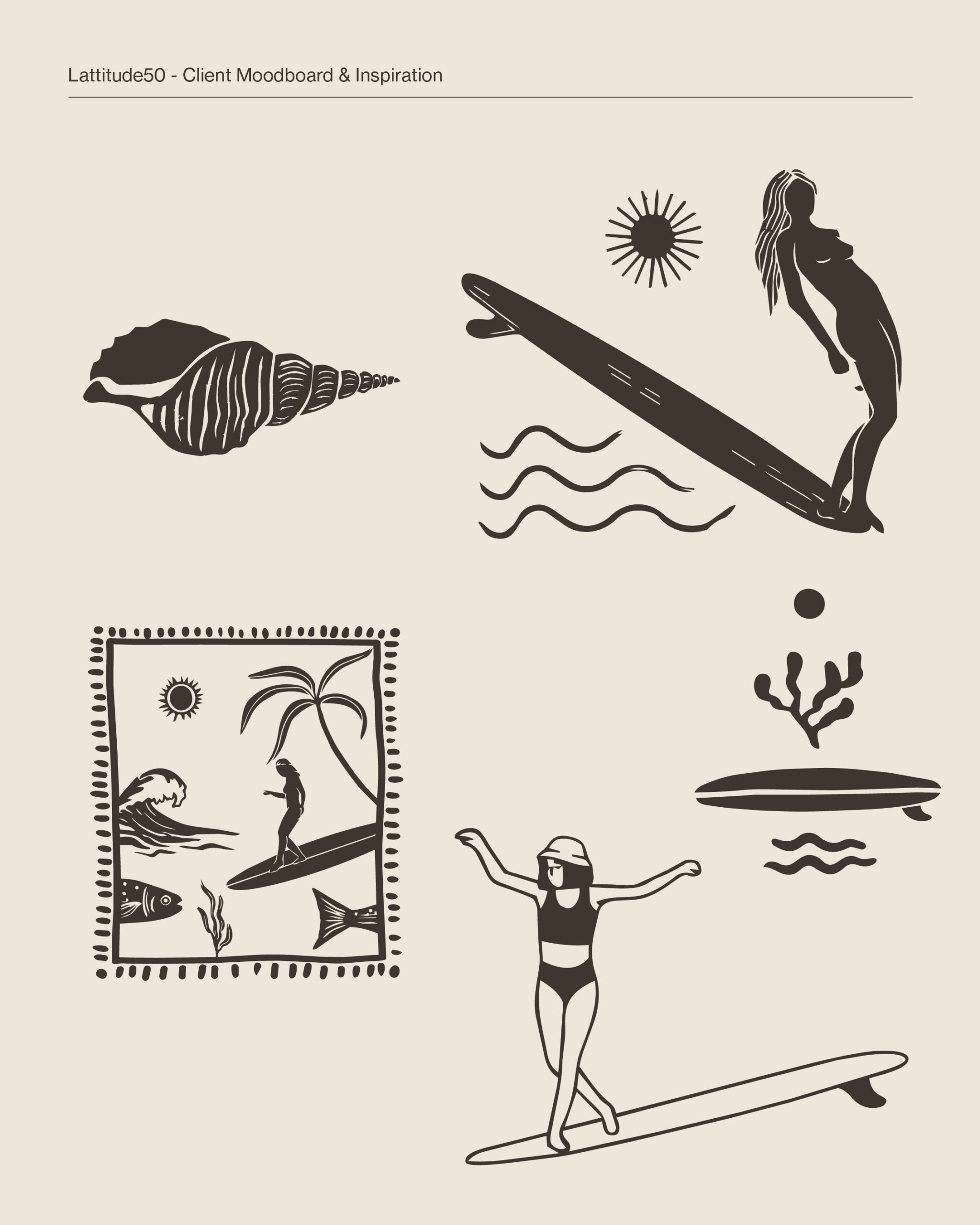
Rather than holding onto the lino print texture itself, we focused on one of its most recognisable qualities – the inverted line. It became the foundation for everything that followed.
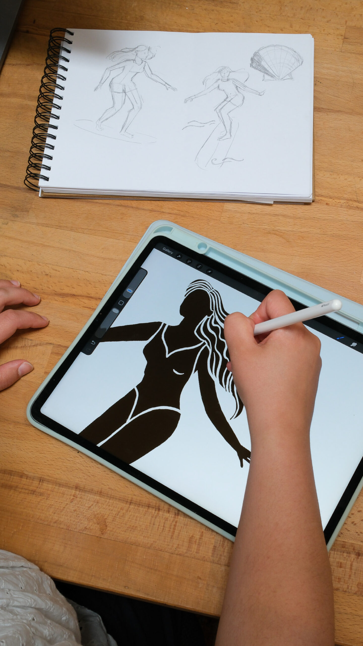
Each illustration began life by hand, sketched out until the composition felt right before being scanned and finished digitally. We deliberately kept the slightly imperfect lines; the tiny inconsistencies that remind you there’s a person behind the artwork. Those details give the illustrations their charm.
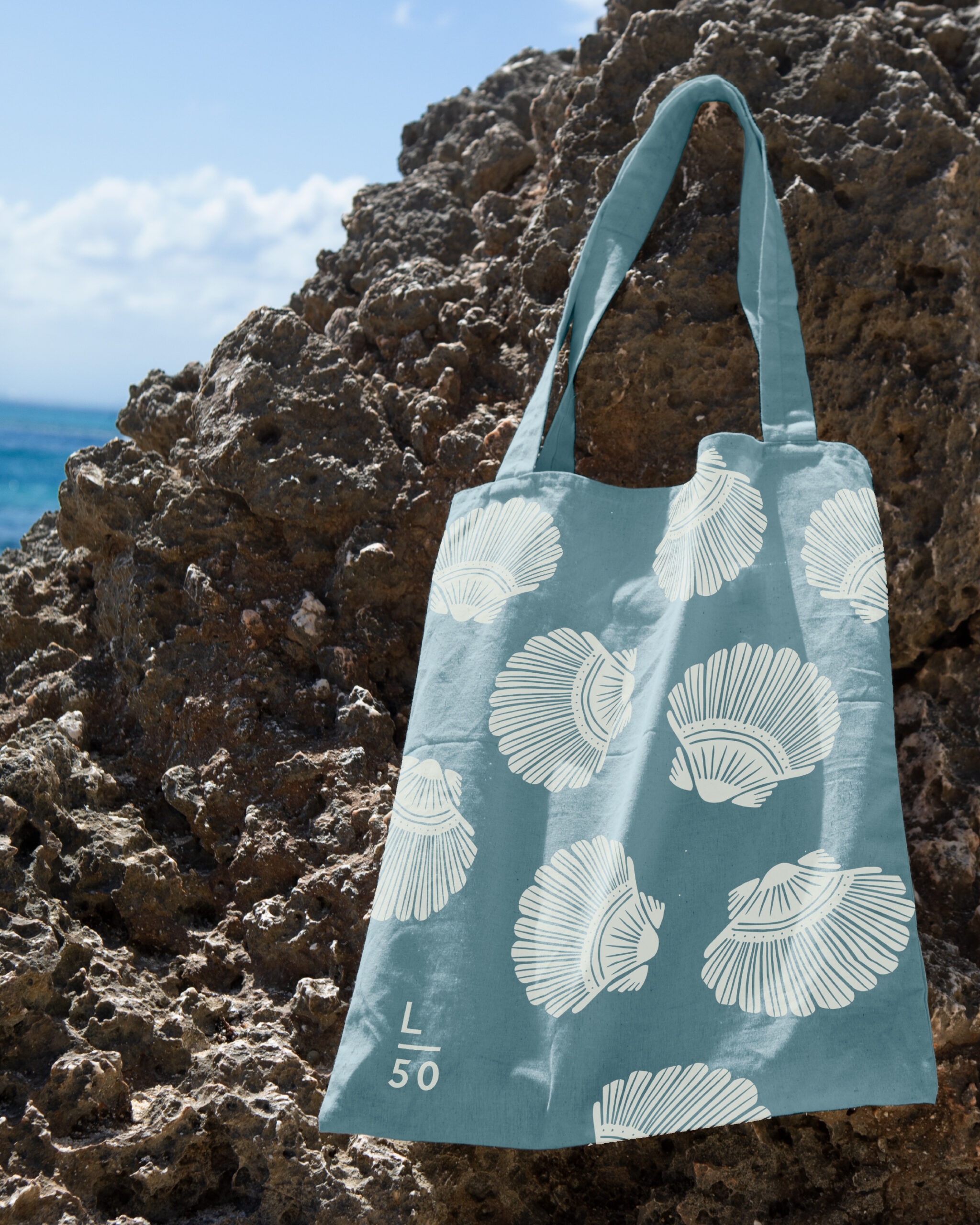
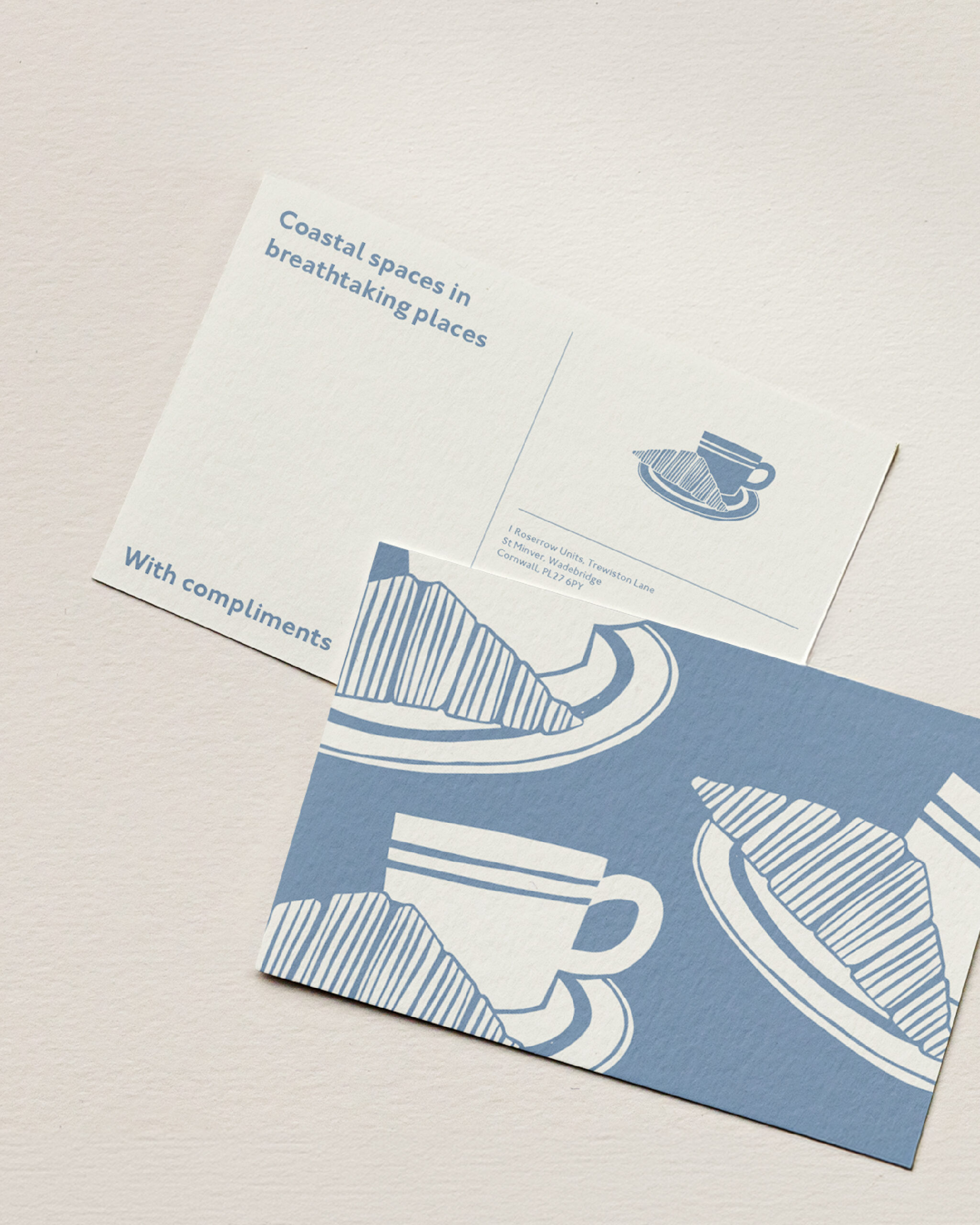
The result is a collection that feels lighter, cleaner and more contemporary, without losing the character that made the originals so distinctive. They’ll find their way onto everything from tote bags and postcards to newsletters and social media, becoming another layer of the Latitude50 story.
It’s a reminder that refreshing a brand doesn’t always mean starting again. Sometimes the best ideas are already there. You just have to know which parts are worth holding onto.