Hot Takes: The Design Sites We Can’t Live Without
Fri 11 Sep 2026
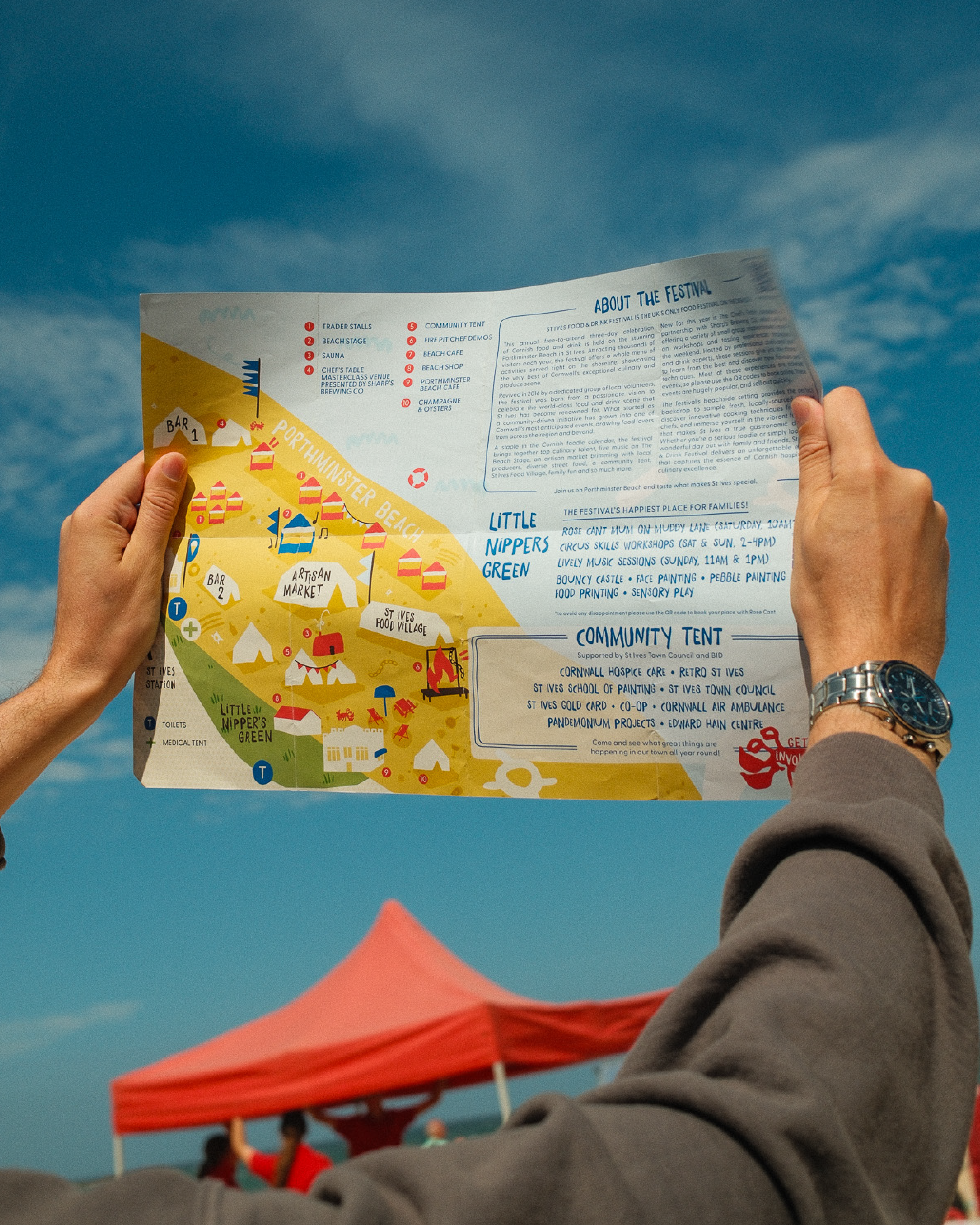
We’ve been working with St Ives Food Festival for years. It’s pretty much on our doorstep, so it’s become a bit of an annual highlight for us.
When the festival came to us for a brand refresh, we gave the identity a bright new look and, with it, a full flavour refresh.
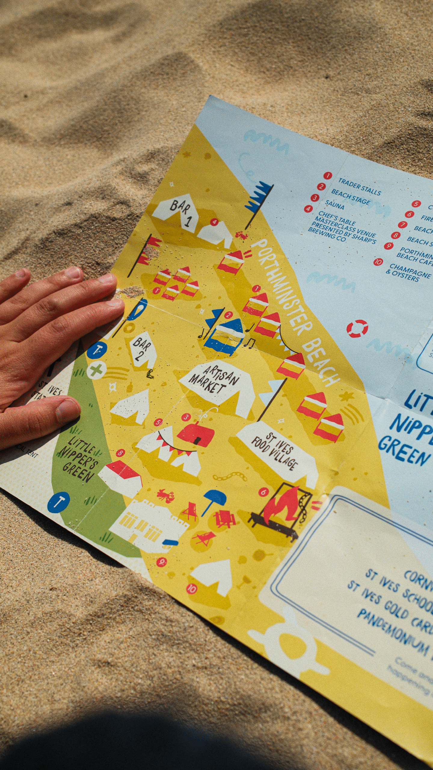
One of our favourite bits to work on was the festival’s “fun map” – an illustrated guide to help people find their way around Porthminster Beach on the big day. It pops up across the festival’s print, socials and website, so it needed to look good, but more importantly, it needed to actually work.
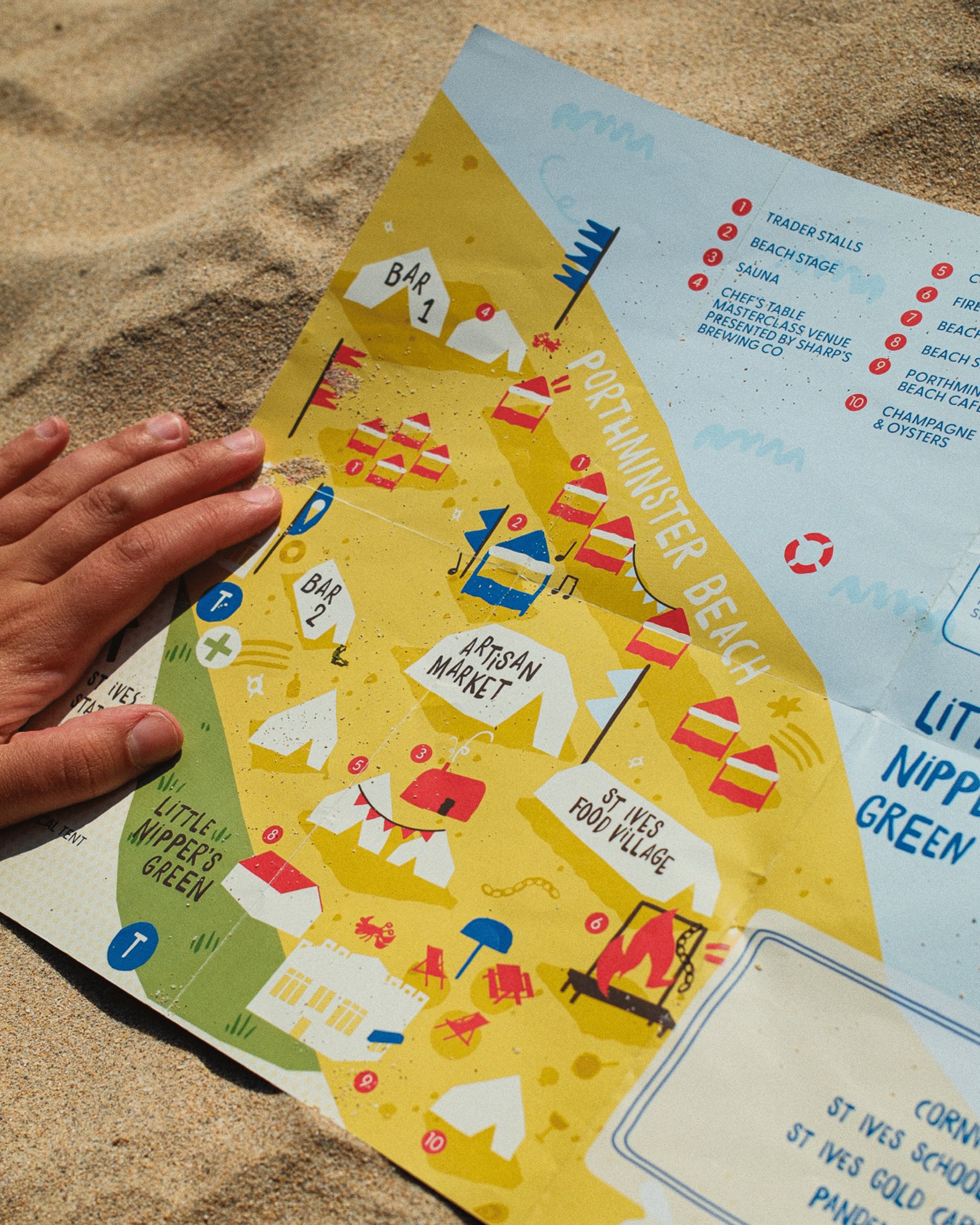
We started by looking at maps we loved, from festivals to national parks, and exploring how they used illustration, colour and shape to make a lot of information feel simple.
The new brand was all about bold shapes and bright colours, so the map followed suit.
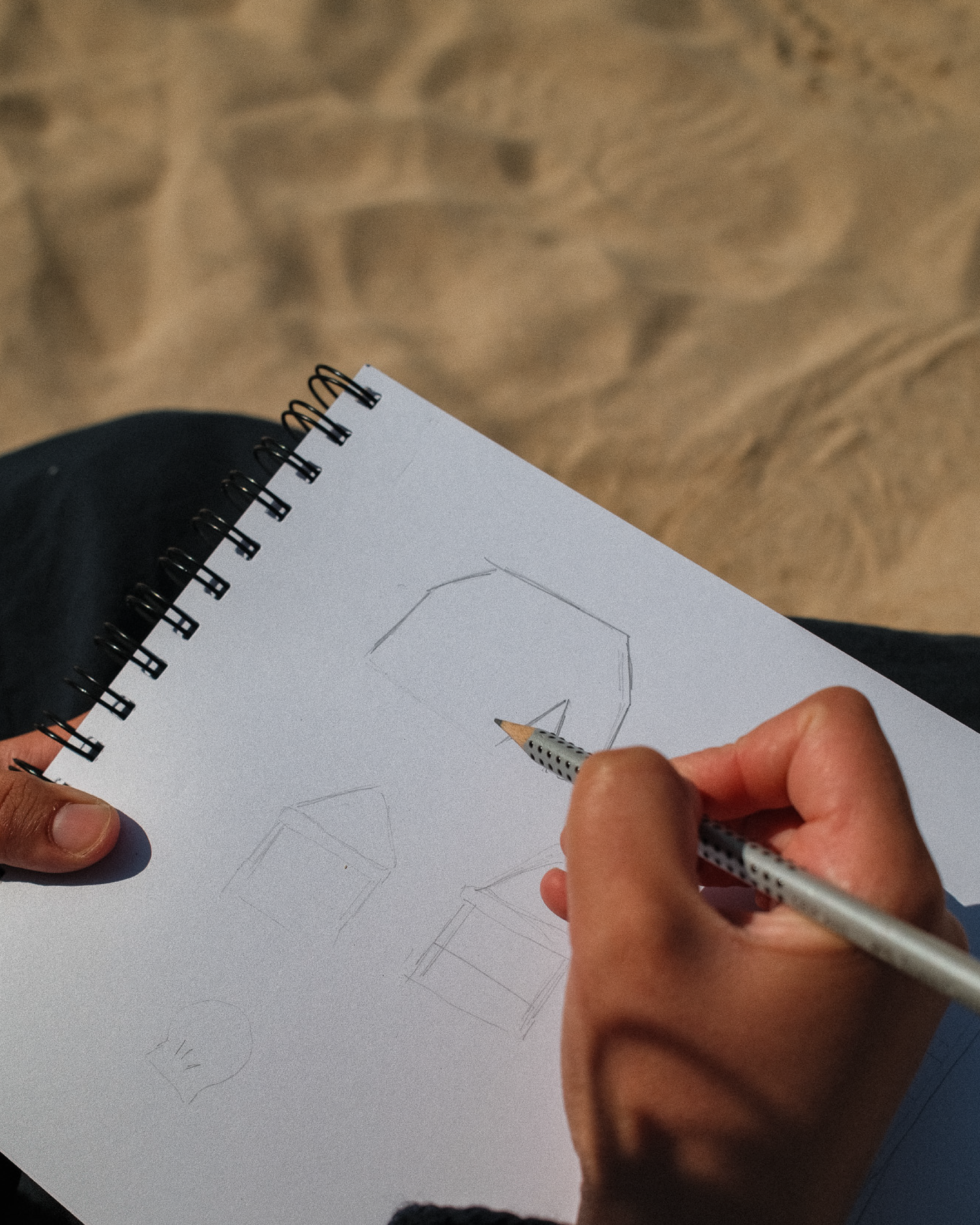
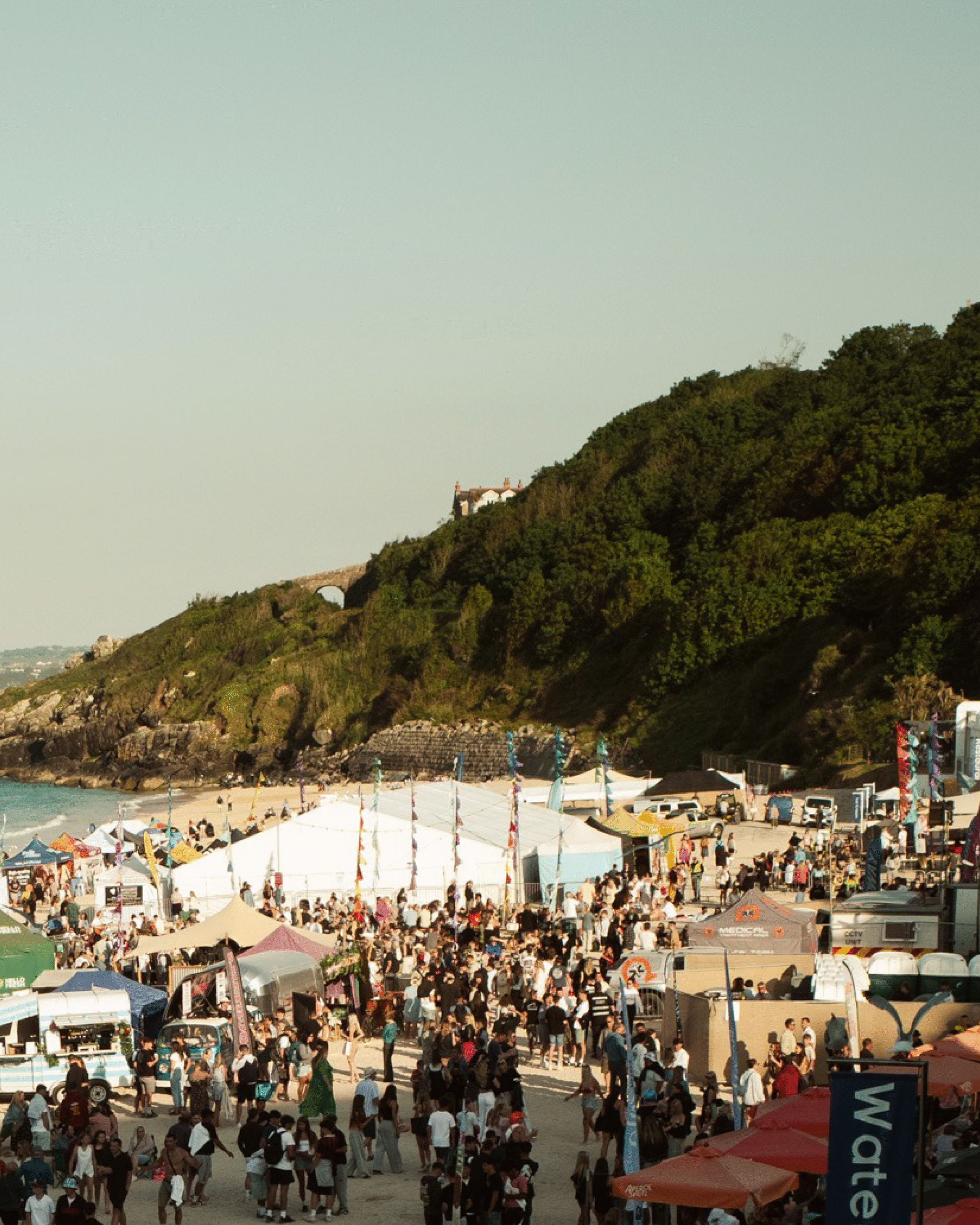
Then came the important bit: getting down to Porthminster Beach and figuring out the space. There’s no point making a beautiful map if it sends people in the wrong direction.
With the layout nailed, we started sketching out all the different elements of the festival. There was a lot to fit in, so we kept things simple and recognisable, with a numbered key to make navigating the map as easy as possible.
The new brand’s warm, colourful palette did a lot of the heavy lifting here, giving us that bright, beachy feel we were after.
And finally, we brought the map to life with a bit of subtle animation for digital, alongside interactive elements on the website to make exploring the festival that little bit easier.
A fairly small part of a much bigger festival identity, but one we had a lot of fun with.