Behind the Screens: A Topographic Story
Mon 9 Nov 2026
With AI flyers everywhere these days, we wanted to show you a bit of the thinking and making that goes into our poster-making process. So, here are a few of the things we consider, alongside some tips you can try for yourself.
At Meor Studio, we create posters for The Beach House Group. And, as they tend to get a lot of love, we thought it would be fun to share a little behind-the-screens into how we make them.
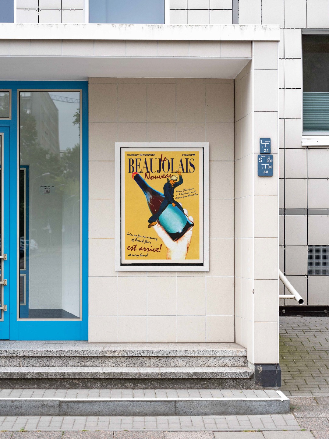
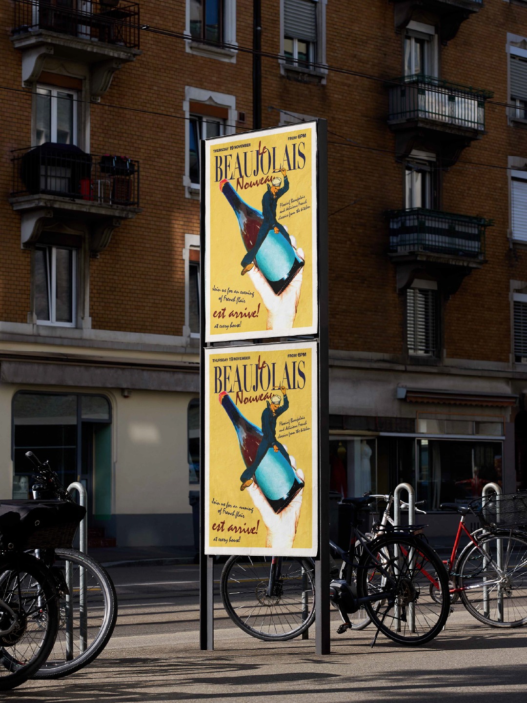
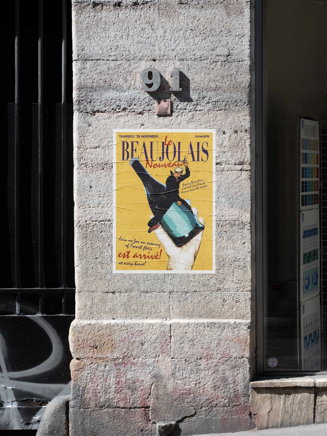
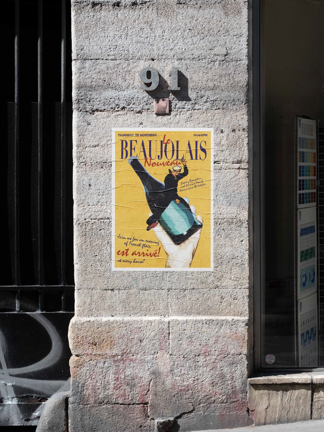
This time, since its coming up, we thought we’d show you our process of making our most recent poster for Harbour House’s Beaujolais Day celebration.
01. Research & Inspiration
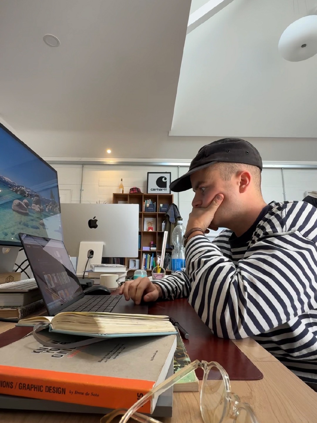
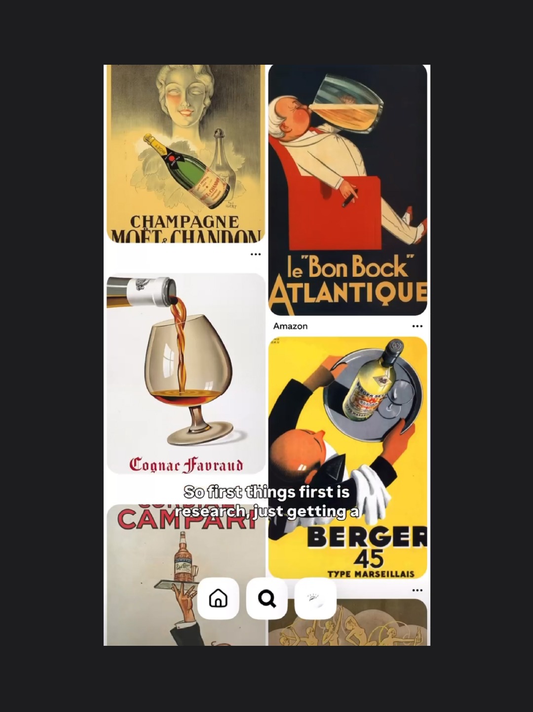
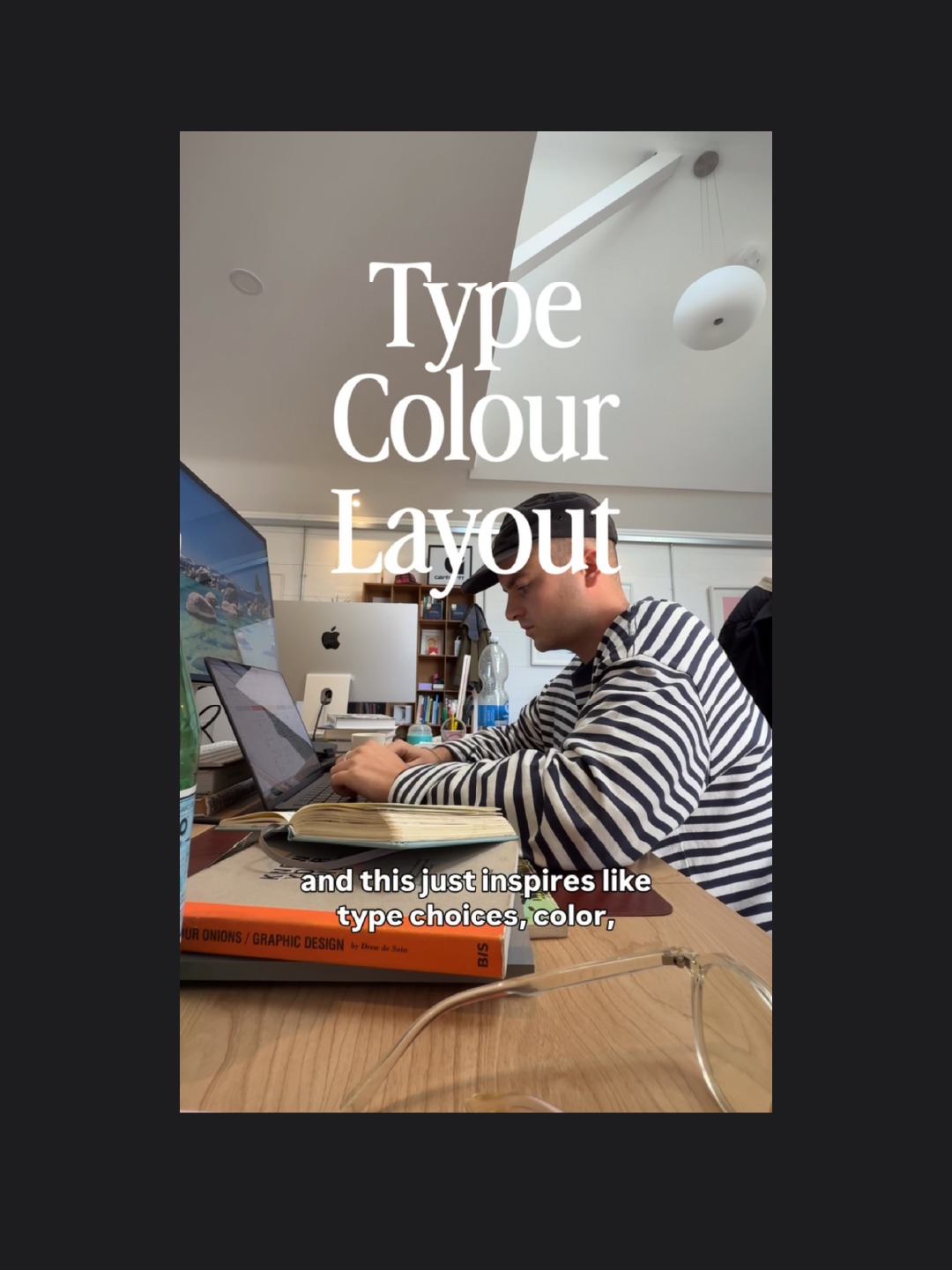
Before we design anything, we do a good bit of reading and research. This helps us understand the cultural landscape the poster needs to sit within and identify the references that might steer our design.
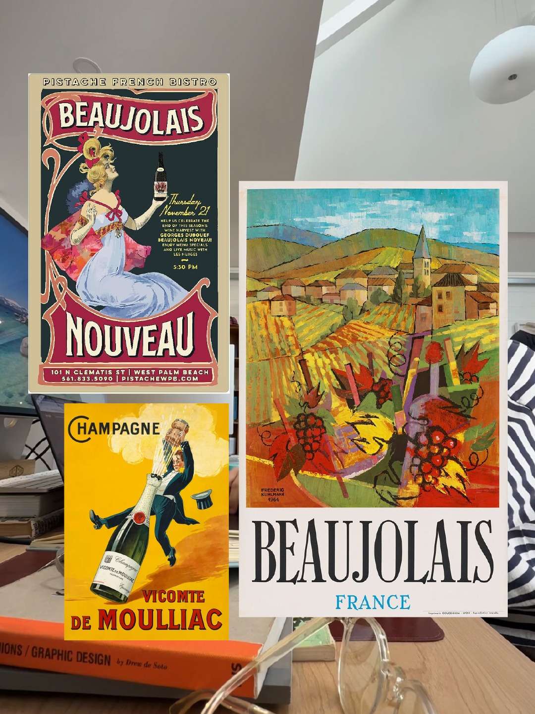
Research is a pretty big part of our process. Without it, you’re pretty much stabbing in the dark. There’s usually something in these references we find, whether it’s a particular typographic style, a colour palette, or even something as subtle as the language being used, these all help shape the direction of the design and make it feel like it belongs.
It’s not about copying what already exists, but understanding the world we’re designing for and finding the right ingredients to create something that feels relevant, considered and hopefully, a little out of the ordinary.
02. Textures
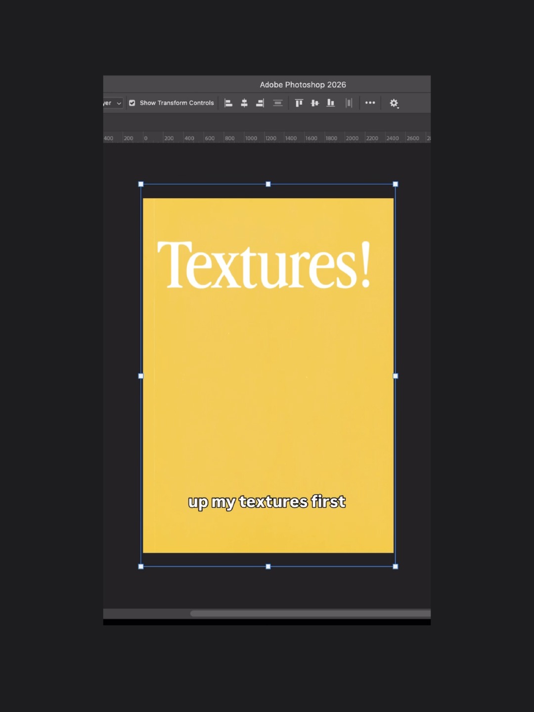
Once I’ve got a feel for the research and the world the poster needs to live in, I jump into Photoshop. I’ll start by laying down a background colour inspired by what I’ve been looking at, then get my textures in place.
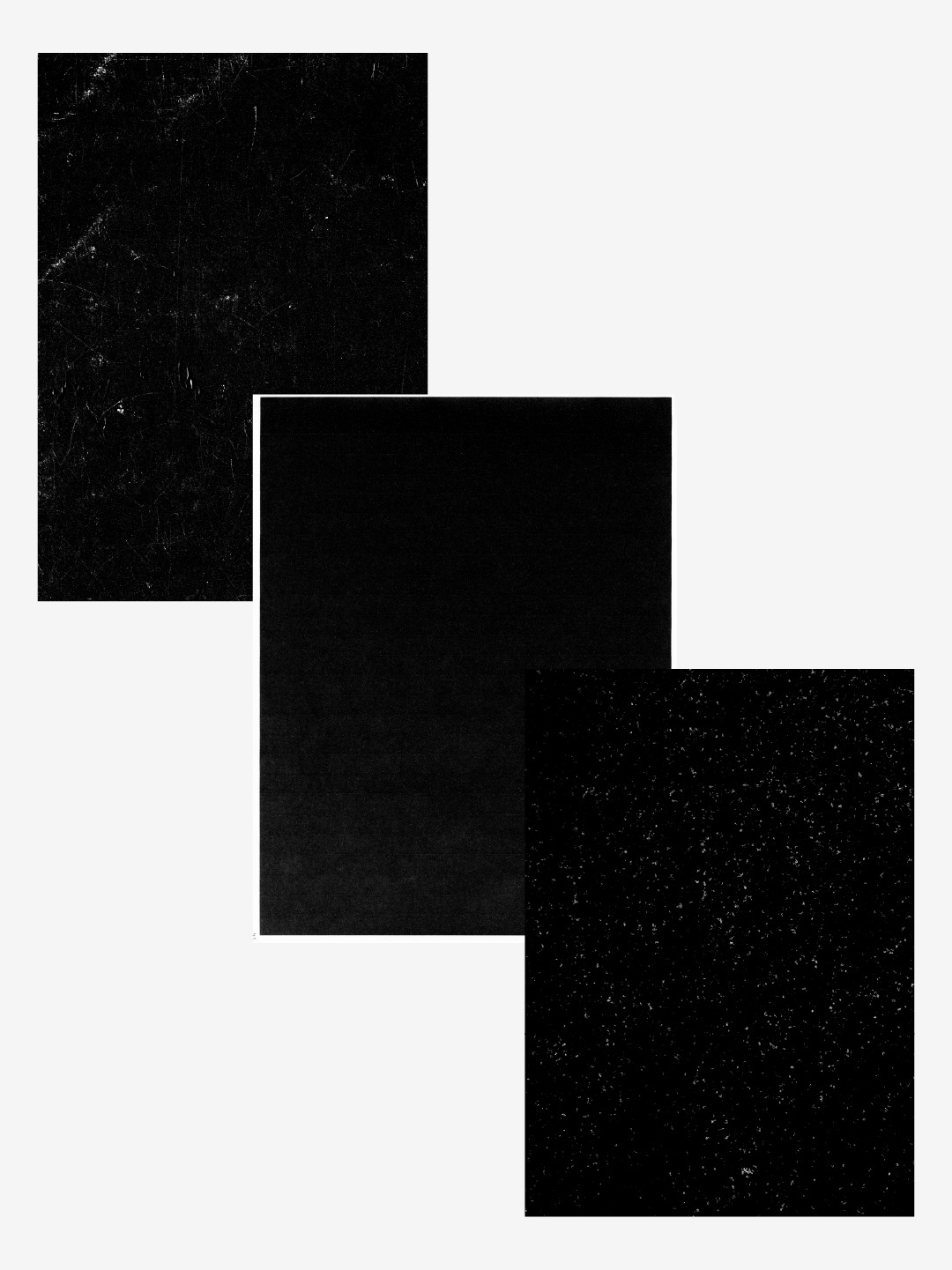
A lot of designers leave texture until the end, but I prefer to introduce it right at the beginning. You can spend hours working on a design, only to add your textures at the final stage and find that your colours, blacks and images all look completely different. Not ideal when you’ve spent the last couple hours getting everything just right. By adding my textures early and locking them to the top, I can see how everything will look as I work. It means fewer surprises at the end and a much clearer idea of how the finished poster will feel from the start.
I’ve been using the same texture pack for years and it’s never let me down. There’s a huge library of them in there, so if you’d like to give them a go yourself, drop us a message on Instagram or send us an email and we can share them with you.
03. Big Focal Points & Scale
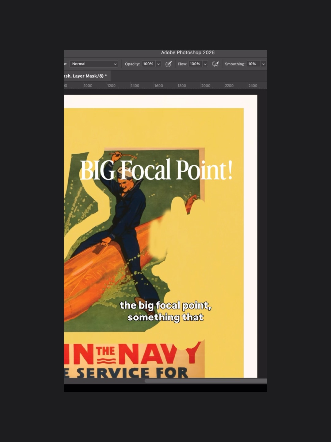
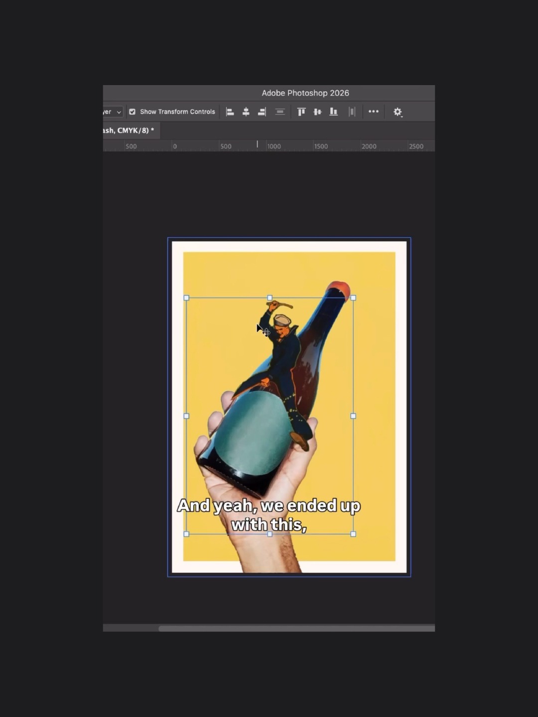
This is probably the most important part of my process and, I’d like to think, one of the things that makes these posters stand out: a big, bold focal point. It’s the first thing people see, so it needs to make an impact. I’d describe my work as slightly weird and wonderful, and I love creating focal points that play with scale, like making big things small and small things big.
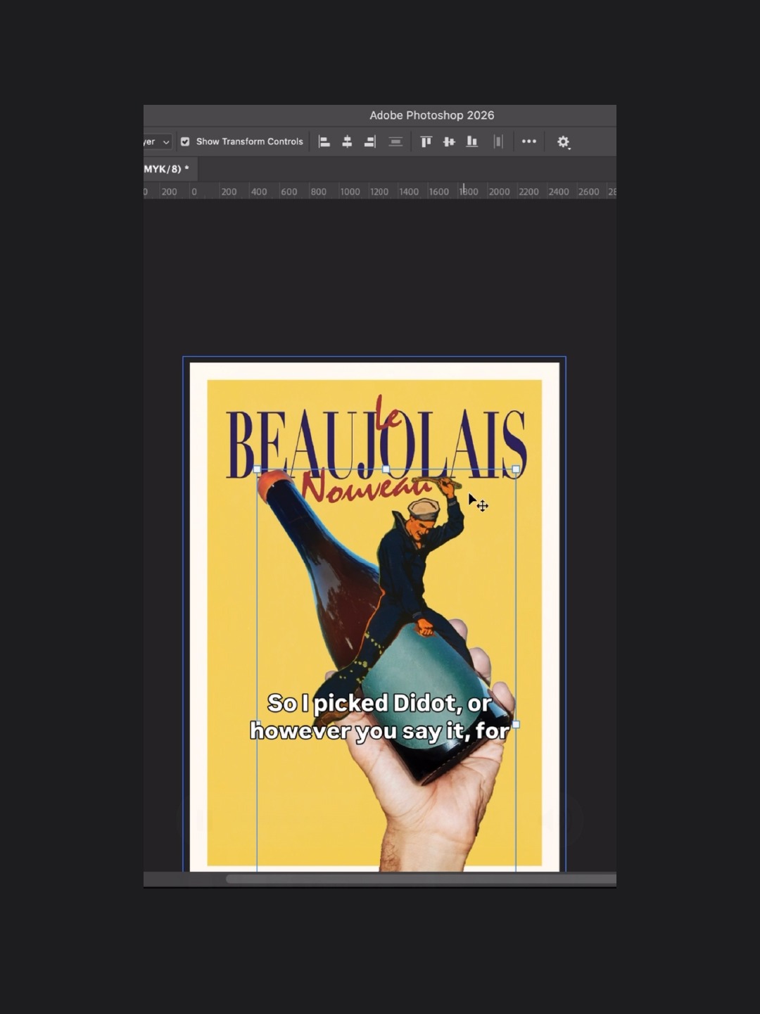
Take our Beaujolais Day poster, for example. There’s a guy riding a wine bottle, which is already a little ridiculous in itself. Then there’s a hand holding the bottle, giving you a sense of scale and making the whole thing even more absurd. I love little details like that. They’re funny, a bit unexpected and hopefully make someone stop scrolling and think, “What the hell is that?” Scale plays a massive part in my work and it’s something I’d definitely encourage you to experiment with, too.
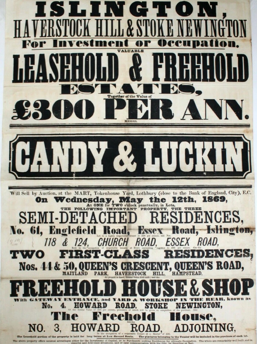
If you look into the history of poster design, particularly early letterpress printing, you’ll notice how much emphasis was placed on typography. Looking at some of the early posters, there’s often very little variation in type size compared with the bold contrasts we see today. That’s what makes the use of scale so powerful when it’s done well.
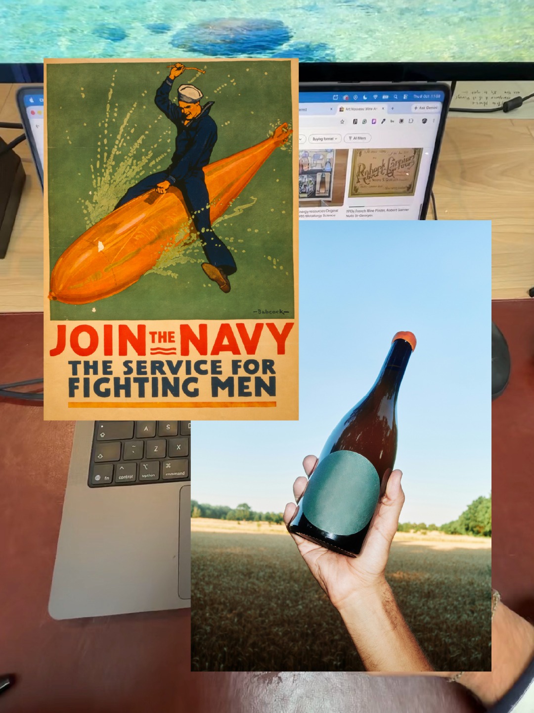
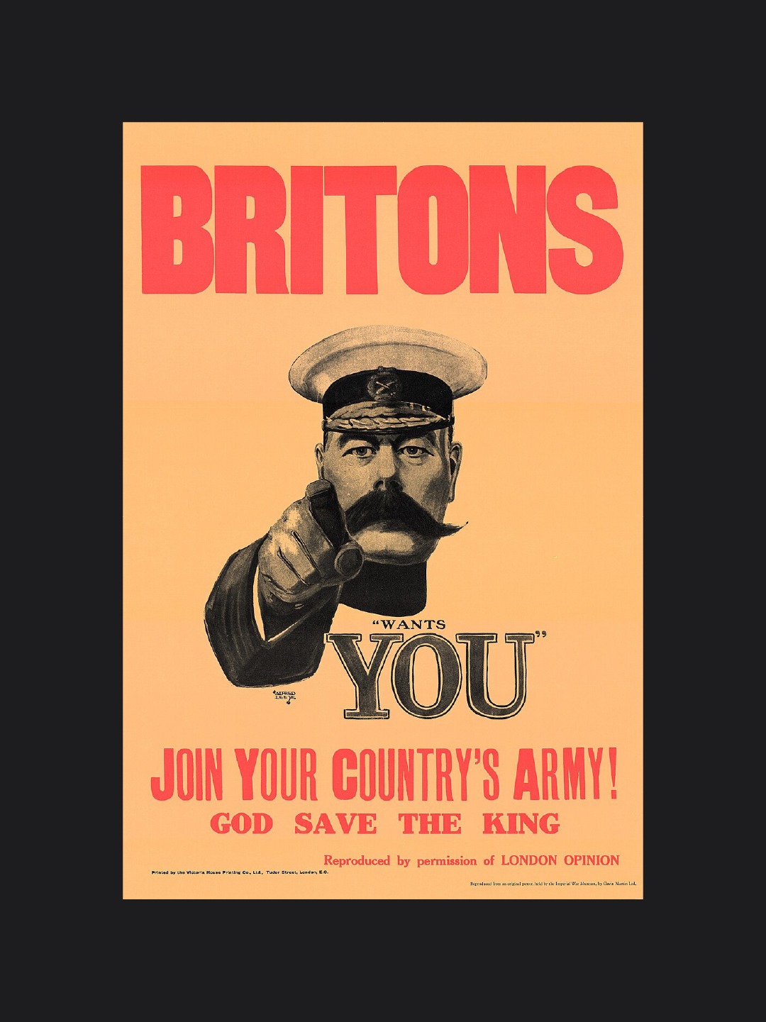
“You only need to look at the iconic Your Country Needs You recruitment poster to understand how effectively a simple consideration on contrast can grab someone’s attention. It’s a great lesson in visual hierarchy and one that’s stuck with me throughout my design career.”
BONUS: Classic Typography
This one isn’t an absolute must, but it’s something I personally swear by: classic typefaces. By that, I mean typefaces that have stood the test of time. They’re recognisable, versatile and hopefully, never going to go out of fashion.
Some of the regulars in my library include Helvetica, Garamond, Mistral, Didot, Futura, Avant Garde, Franklin Gothic and Baskerville. I’m certainly not saying you should limit yourself to these, but I once heard a designer say that you only need five typefaces for an entire career. A handful of these classics would probably make my list.
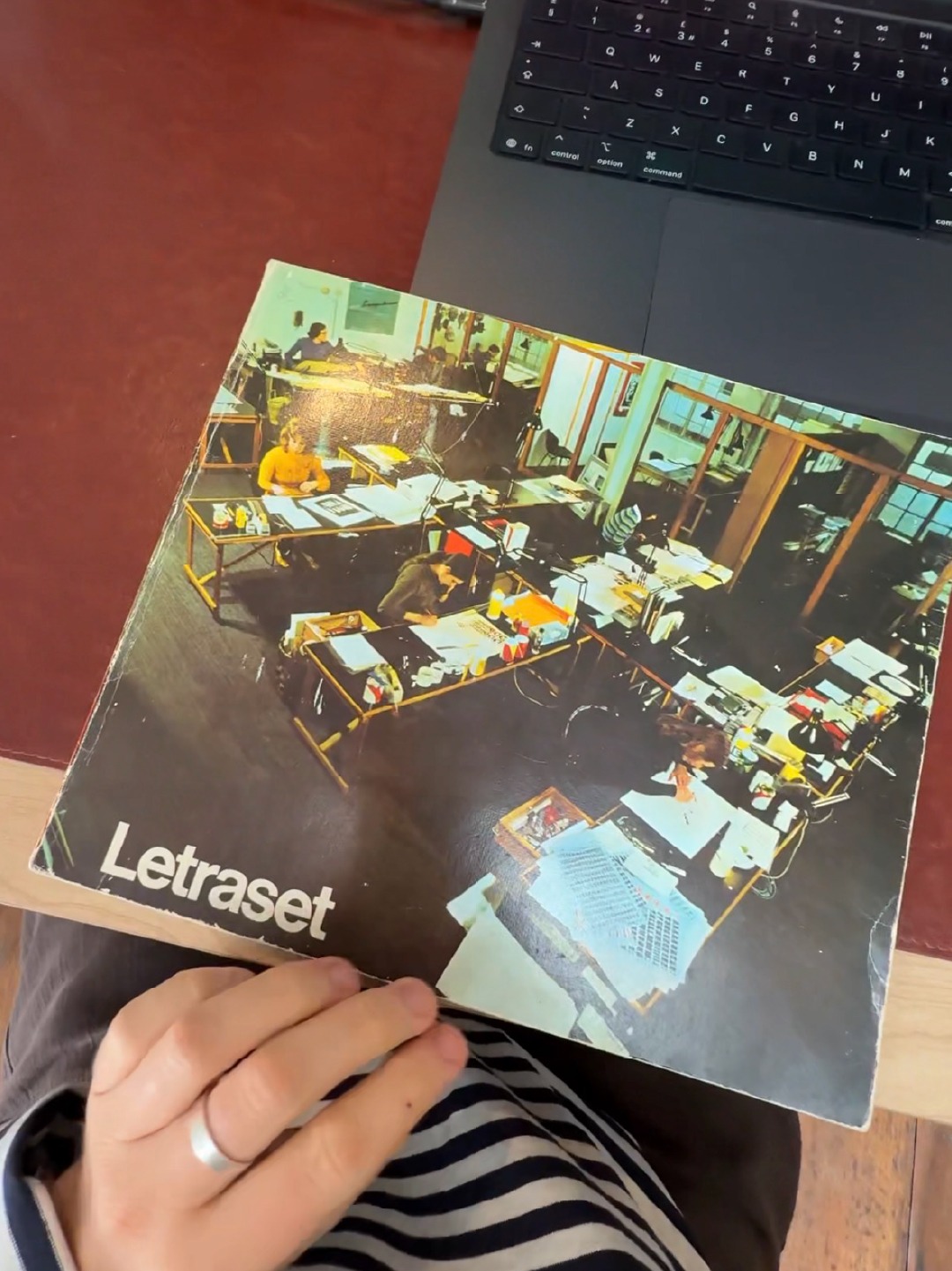
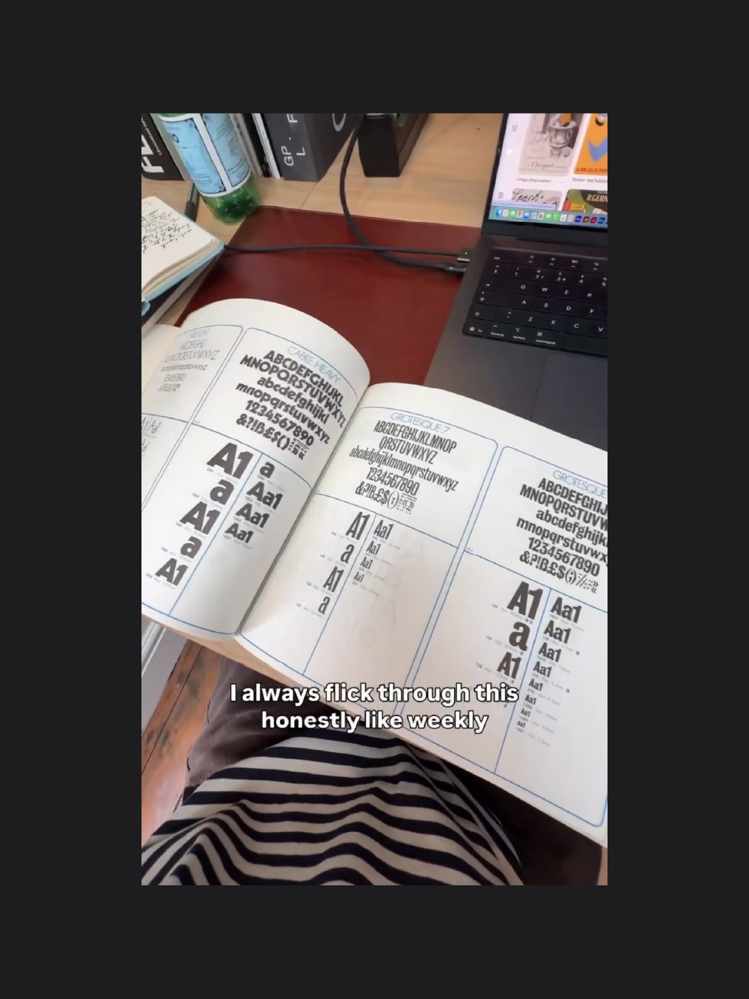
For most of my design career, I’ve relied on these timeless faces to build up a body of work that feels considered without becoming dated. That’s the tricky thing about following typographic trends: they go out of fashion as quickly as they came in. That’s why I rarely go looking for the hottest new typefaces of the year when designing these posters. Outside of this particular style of work, though, I’m always exploring what’s out there. I’m especially into what ABC Dinamo and Central Type are doing at the moment.
It’s not about avoiding new things; it’s about knowing when a classic is the right tool for the job.
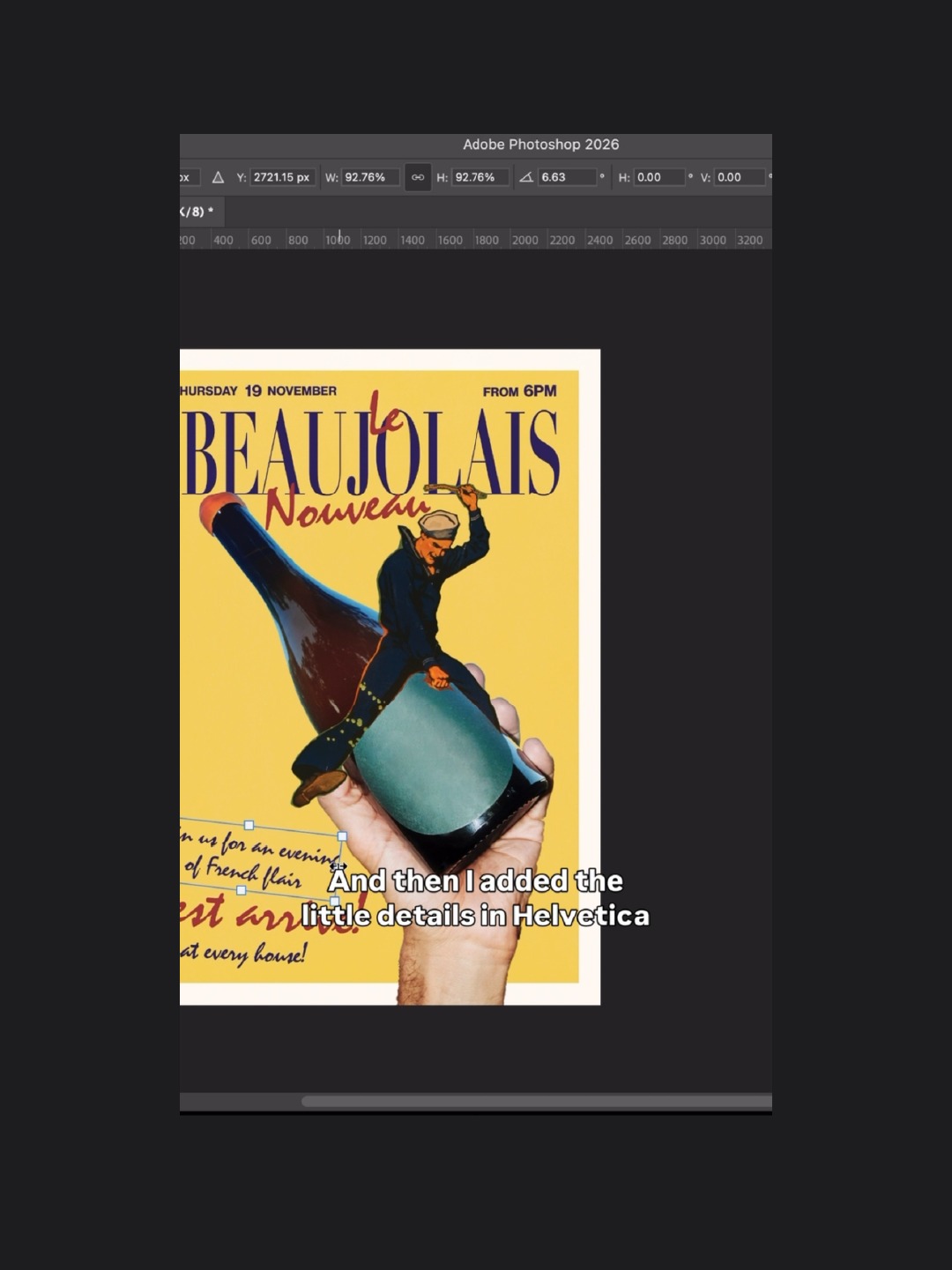
So, there you have it. Those are a few of the key things I consider before getting stuck into a new poster for The Beach House Group.
From the initial research to the textures, focal points and typography, every decision helps build towards the finished piece. Hopefully, there’s something in here you can take away and apply to your own work.